Просмотр новости
Найдите то, что Вас интересует
 Спутники
 РН
РН SpaceX
 Роскосмос
 NASA
NASA
СпутникиРНSpaceXРоскосмосNASAGo behind the scenes with our team as we find and make sense of the numbers.
Turn on the news, scroll social media, or talk to family and friends, and it’s immediately clear that affordability is top of mind for a lot of people.
Google search data backs that up. Americans’ interest in the term “affordability” is peaking this year — surpassing its previous high during the Great Recession.
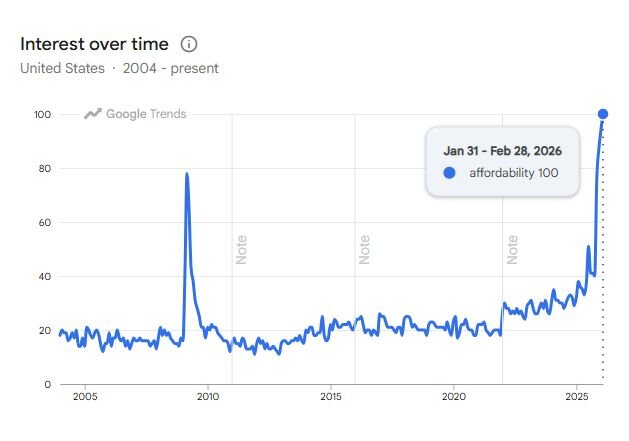
Measured on a scale where 0 equals no interest and 100 equals highest interest ever, the term “affordability” reached its peak interest level on Google in early 2026.
Affordability goes hand in hand with that other buzzword: inflation. Here at USAFacts, we analyze costs through measures like inflation, but that’s not all there is to affordability. After all, inflation just measures by what percent prices increased on average. It doesn’t say what the actual prices are. And although prices vary across the country, typical inflation measures have limited geographic specificity (different regions, like the South or Northeast, and 30ish large metros).
So, when I really want to get into the nitty-gritty of affordability, one of my favorite tools to use is Regional Price Parities, or RPPs, from the Bureau of Economic Analysis (BEA). If your eyes have glazed over, I understand, but despite their rather very boring name, RPPs measure something inflation doesn’t: how high, or low, prices are and how those levels differ from place to place.
For analysts like me, that’s super valuable because it means I can add nuance to my work. But it’s also useful for those who don’t spend their days knee deep in spreadsheets and are just trying to decide if they want to move somewhere new because they heard it’s more affordable, or are negotiating pay in a new place and want to maintain their current standard of living, or are retiring and want to know where their savings will go furthest or… well… you get the idea.
My editor: “RPPs sound useful, tell me more!”Good instinct! RPPs are useful, not only for analysts like me, but real people trying to make data-informed decisions. I’ll illustrate with an example.
Let’s say I have received two job offers, one in San Francisco for $70,000 and one in Monroe, LA for $55,000. If I only look at the two salaries, I’m obviously taking the one in San Francisco — it pays 27% more! But the math quickly changes once I realize that, based on RPPs, the cost of living faced by San Franciscans is nearly 16% higher than the US average, and the cost of living in Monroe is 16% less. Once I account for this cost-of-living difference, I’d actually be better off taking the job in Louisiana, by about 9%!
How did RPPs help me make this determination? We’re all nerds here, so I’ll give you the wonky definition first, then show you the math. RPPs measure how price levels vary across the country each year. They are an index where the average for the entire US is 100, and each geography is given a value on the index, either below or above 100. Above 100 means prices in that place are higher than the US average and values below 100 mean prices are below the US average.
San Francisco’s RPP in 2024, the most recent period available in the data (and of course released when I was halfway through writing this, both exciting and incredibly inconvenient), was 115.613, and Monroe’s was 83.597. To calculate the cost-of-living adjusted salary offered by the two job offers on the table, I first divide 100 by the RPP. Then I multiply that number by the offered salary.
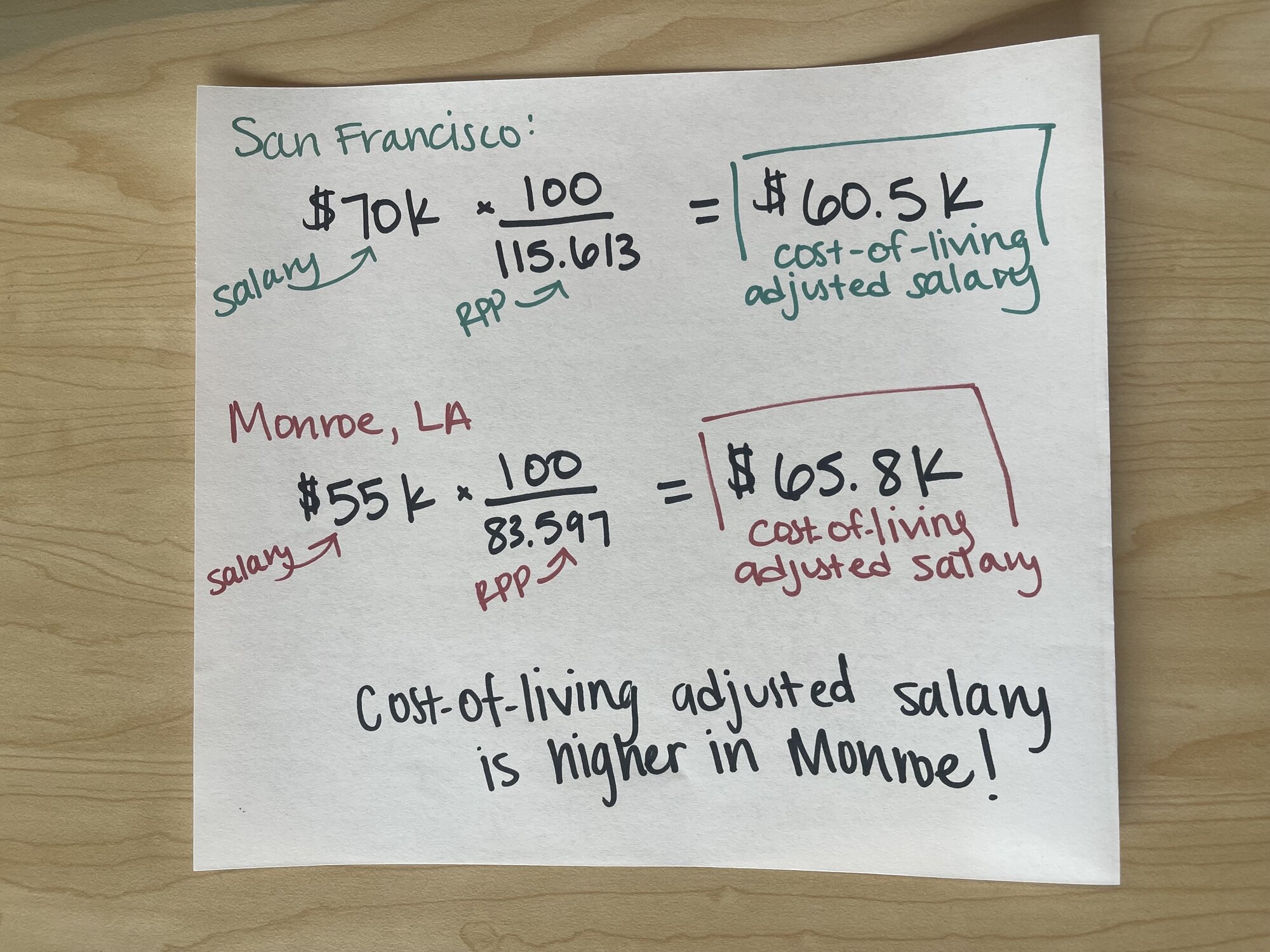
Applying the formula to adjust the offered salaries in San Francisco and Monroe, LA tells me that, on average, I’d be better off taking the job in Monroe.
Voila! This takes my $70,000 salary and gives me an adjusted salary of $60,500 in San Francisco while increasing the $55,000 salary offered by the job in Monroe to $65,800. My dollar would, on average, go further in Monroe than in San Francisco, even though, on paper, my salary would be $15,000 less.
In other words, living in Monroe with a lower unadjusted salary is the more affordable option.
My editor: “… that it?”And that’s not it! In the Monroe/San Francisco example above, I used the RPP index for “All items” at the metro area geographic level. But there are several types of index options available, depending on what you’re most interested in, or the data you’re trying to adjust.
First, there are indices available for different geographies:
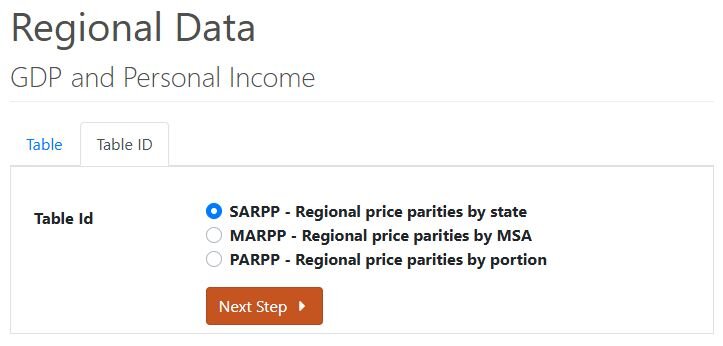
SARPP, MARPP, and PARPP are the abbreviated names for RPP geographies. Sounds like some sort of fairytale trio.
Second, there are also RPP indices for different kinds of prices. Each of the above geographies has five different options, and most of them are self-explanatory:
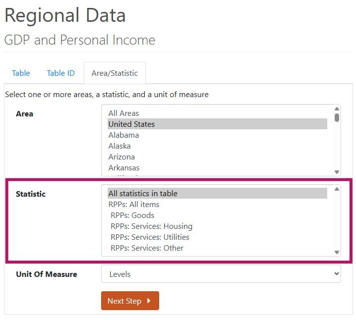
This screenshot shows all the different RPP indices available for states, but the same set is available for all geos.
So which index is the best? Is there one RPP index to rule them all? Nope, it entirely depends on your use case. Interested in housing cost differences across states? Use the state housing RPP index. Want to consider utility cost differences between rural areas? The portion utilities RPP index is probably your best bet. At USAFacts, we most often use the state all items index due to the nature of the data we’re adjusting (often at the state level, and not item-specific).
My editor: “Show me a map!”I could not agree with my editor more. Anyone who has made it this far deserves to be rewarded with the most fun data viz of all: a map.
So, here is a map that combines the all items index for metropolitan areas and the all items index for the rural portions of states. It shows by what percent prices are higher or lower than the US average in these regions.
RPPs show that people in the San Francisco area have the highest cost of living (15.6% higher than the US average) while those in rural Arizona face the lowest (18.3% lower than the US average).
My editor: “Okay, wrap it up!”RPPs are one tool we use to better understand how far a dollar goes in different places. We’ve used it when we talk about teacher salaries and police officer salaries, for example.
Of course, RPPs aren’t perfect. They reflect averages, not individual spending habits. And they’re released with a lag — the most recent data is for 2024. But they are more geographically specific than national averages alone. As I, a stereotypically perfectionist first-born daughter, have to constantly remind myself, we can’t let perfect be the enemy of the good. And RPPs? They’re a good.
| # | Наименование новости | Тональность | Информативность | Дата публикации |
|---|---|---|---|---|
| 1 | Ask an Analyst: Putting White House construction in context | 0 | 9.22 | 12-02-2026 |
| 2 | Ask an Analyst: Creating a data-driven State of the Union | 0 | 11.23 | 19-02-2026 |
| 3 | Ask an Analyst: Lending some color to the political map | 0 | 8.52 | 12-03-2026 |
| 4 | Ask an Analyst: Searching for data on ICE | 0 | 9.18 | 29-01-2026 |
| 5 | Ask an Analyst: Putting the pieces together on military troop data | 0 | 8.57 | 05-02-2026 |
| 6 | Analyst Notes: Five foundational concepts for understanding data | 0 | 9.18 | 18-06-2026 |
| 7 | Ask an Analyst: What's up with changing job numbers? | 0 | 7.74 | 26-02-2026 |
| 8 | Ask an Analyst: What makes a "donor state"? | 0 | 9.18 | 26-03-2026 |
| 9 | Analyst notes: The clock on Congressional sessions | 0 | 8.34 | 27-04-2026 |
| 10 | Analyst notes: Why do murder rates differ between federal sources? | 0 | 9.25 | 07-05-2026 |