Просмотр новости
Найдите то, что Вас интересует
 Спутники
 РН
РН SpaceX
 Роскосмос
 NASA
NASA
СпутникиРНSpaceXРоскосмосNASAGo behind the scenes with our team as we find and make sense of the numbers.
“Let the data speak for itself” is a common refrain in the world of data and visualizations. But charts can have characteristics that can affect how they are interpreted.
At USAFacts, we share the data and let you draw your own conclusions. To help put that data in context, I’ve identified five foundational concepts that can shape how data is collected, reported, and interpreted. Understanding them can help you get more out of the charts and datasets you see here, and elsewhere.
Let's get into it!
Administrative data: everyone is countedFirst up, let’s establish what a “population” is. A population is the total number of people in a defined group, such as those living in a particular area, enrolled in a program, or included in a study. (It could also be like, all of the fish in a pond, but we’ll stick to people examples).
In “administrative” data, everyone in a population is included in the dataset.
Administrative datasets can provide more accurate and detailed information because they count everyone in a group rather than estimating characteristics from a sample.
Government datasets can achieve administrative data in a couple of ways. One of them is on a rolling basis, like via a government program (like Medicare, Medicaid, and SNAP), in which people are required to share information about themselves to enroll.
Another way is to collect population data all at once, which is what the Census Bureau does it once every ten years. The mandate to collect full population data is actually part of our constitution! The word “census” is defined as an “official, periodic count of a population,” meaning a count of every individual.
However, collecting data from an entire population is often more expensive and time-consuming than surveying a subset of people. This brings us to a second data type...
Subscribe for data-driven insights. No spin, just the facts.
Some government metrics are based on partial population data rather than counting every person, household, or business in a given population. Researchers often use this method when counting every member of a population would be impractical, expensive, or impossible. It also helps with the timeliness of reporting data. (Counting fewer people = faster data gathering.)
In these cases, the government collects information from a representative sample. Then, researchers use statistical methods to estimate values for the larger population, hence the name “statistical” data.
Statistical data is often collected via survey, like through the Census Bureau’s yearly American Community Survey (ACS). The ACS is administered every year, and is made up of data collected from a representative sample of the US.
Surveys administered to sampled populations help provide yearly data to local governments in a more affordable and timelier way than counting every single person (again, counting fewer = faster).
What does statistical data look like?Often, statistical data shows up in values and visualizations in figures and without looking any different than administrative data. You'd only know it by looking at the source:
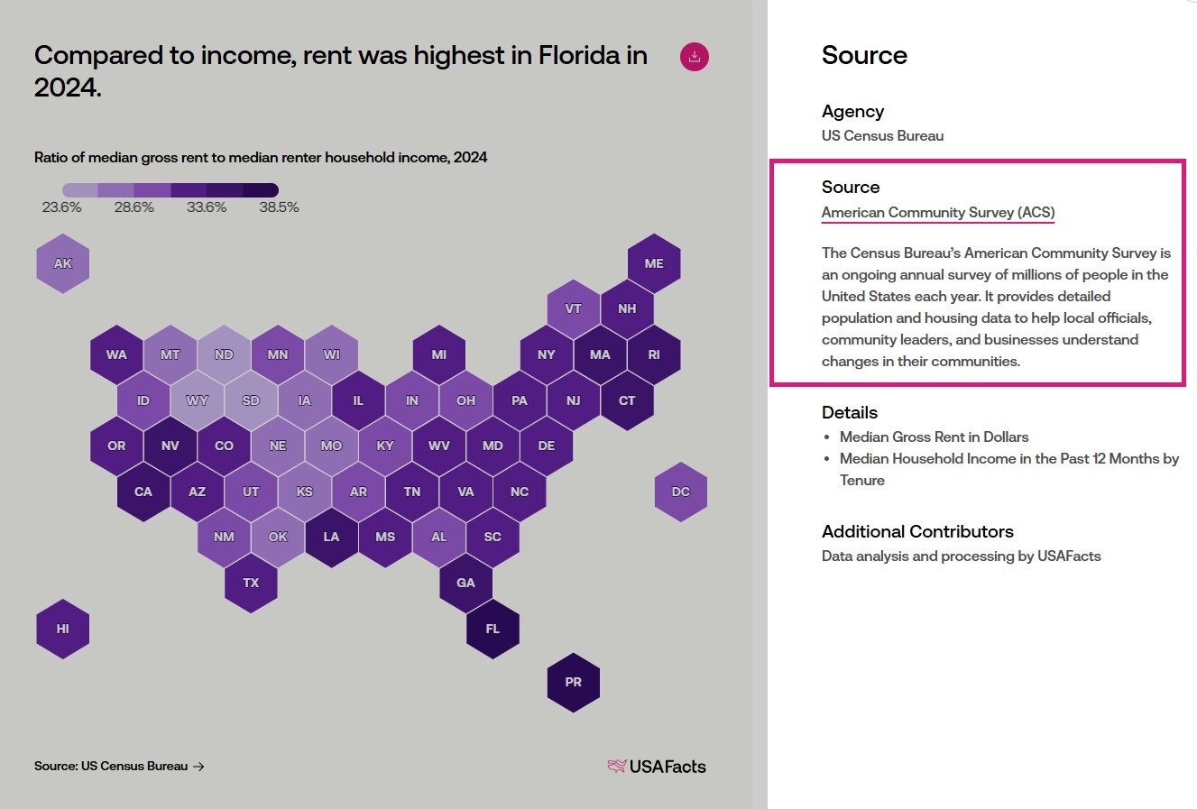
The data source indicates the data comes from a survey.
But sometimes, you'll see charts that show estimates, and something called "confidence intervals." (Sounds a little intimidating, but stick with me!). These are a good clue that the chart is displaying statistical data.
Estimates based on a sample provide an approximation of a population’s characteristics, but they can’t be 100% accurate. The inherent imprecision in these estimates is known as “uncertainty.” Researchers often express that uncertainty using confidence intervals, which is a range within the true value is likely to fall.
Let’s take this chart: It shows food poisoning cases that send people to the hospital with a confidence interval of 90%.
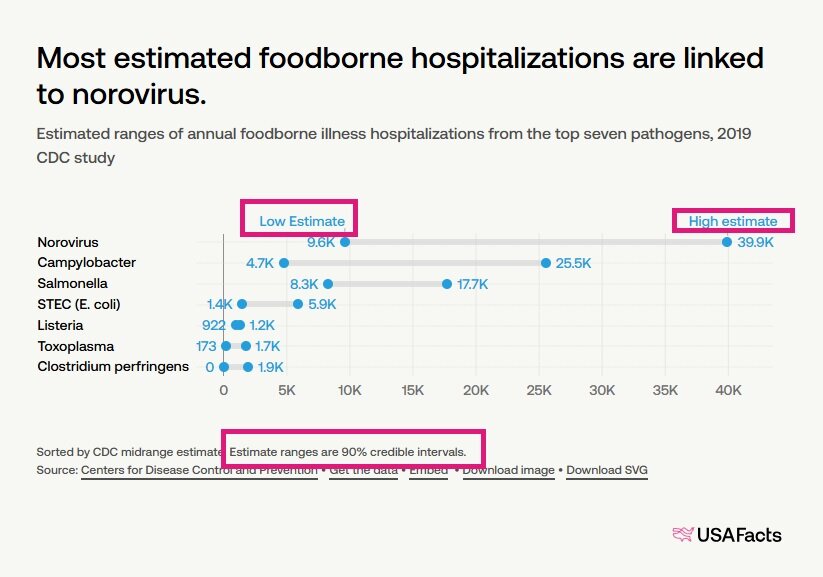
An example of a chart that uses statistical data.
To understand this chart, let's look at the highlighted boxes:
Perhaps you’re wondering: Is 90% a good confidence level? There is no single "correct" confidence level. Researchers choose a confidence level based on the purpose of the analysis and how much uncertainty they are willing to accept. But this comes with some trade-offs: If you want to be more "confident" that your estimate is accurate (that is, have a smaller range), you might have to survey more people.
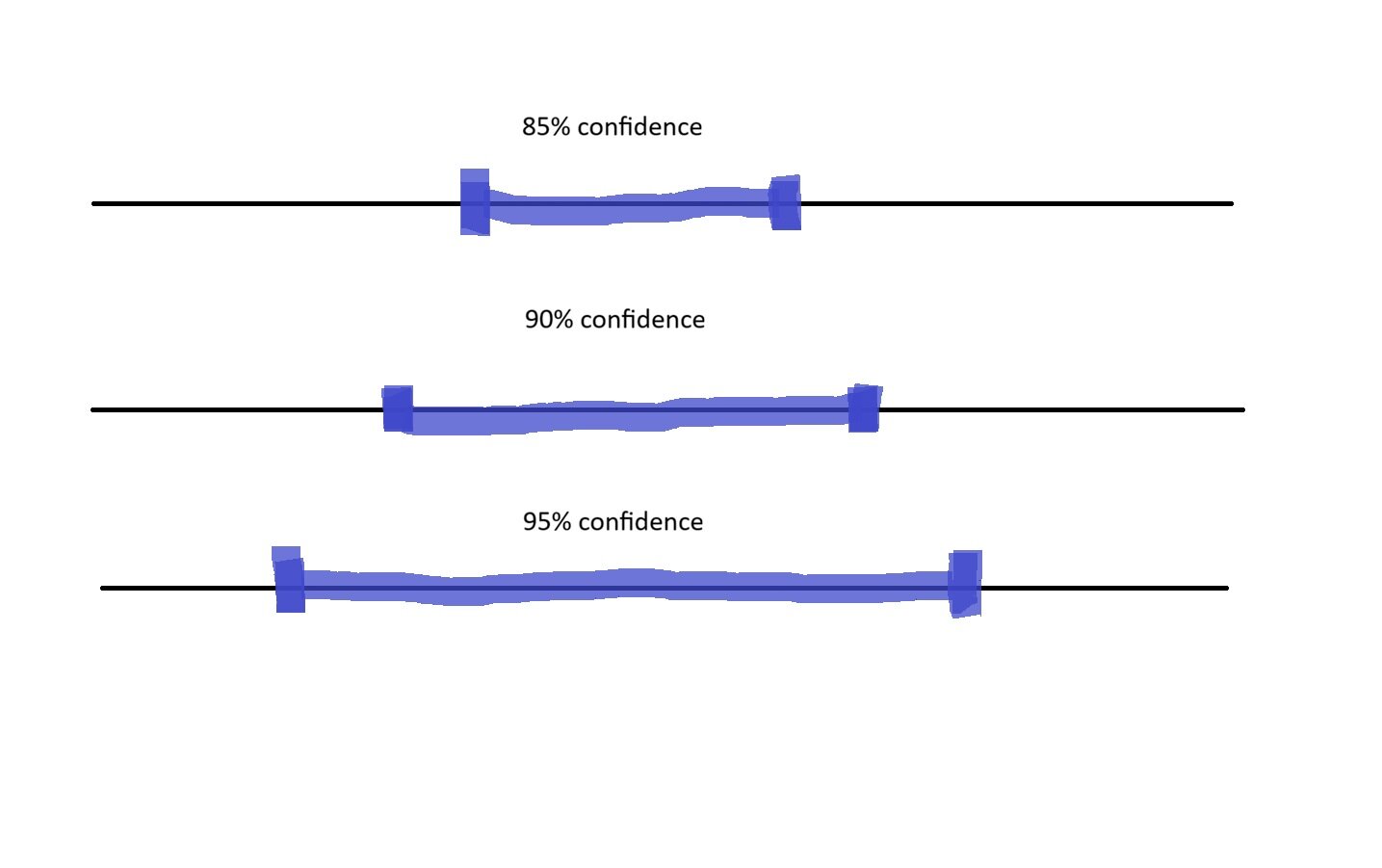
As confidence levels increase, estimate ranges become wider.
A confidence interval provides a range of values that is likely to contain the true population value. Higher confidence levels produce wider intervals because they allow for more uncertainty.
I said I'd stick with “people” examples, but back to fish for a second: a larger confidence interval is like casting a larger net while fishing. The net (range) is wider, but it gives you more confidence that you'll catch the true value.
It’s likely the data is statistical if:
Whew! You made it through the biggest math concepts. Let’s get to the other data types!
Data that isn’t finalizedPreliminary, partial, and in-progress data are examples of when data is not yet final. Why release data before it’s final? Timeliness is often a factor.
Preliminary dataPreliminary data are initial values released before the full data collection and validation process is complete. This data is released before being finalized to provide timely information, but it could change when the final data is published.
Data is often released before it’s final so that users can access current information That’s also useful for spotting early trends. In this chart, a dotted line indicates an initial upward trend for 2024, although the final value may be subject to change.
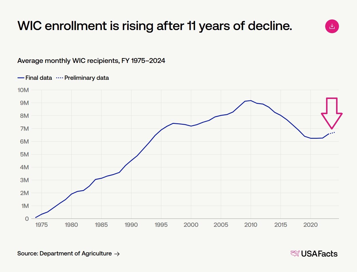
A chart from our article on the WIC program that displays preliminary data as a dotted line.
What’s keeping the data from being finalized? Some reasons include:
Preliminary data is also the reason why the BLS’s monthly jobs report changes values of previous months. When the BLS has more survey data, it can make better employment estimates.
In-progress or partial dataIn-progress or partial data comes from a reporting period that has not yet been completed (like when 2026 data is available, but only through June 2026). The available figures reflect only the portion of the period for data collection and may not represent final totals.
Here’s an example of a chart, also indicated by dotted lines, with in-progress 2026 data.
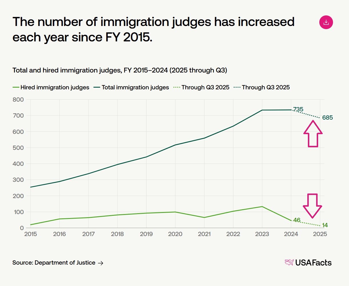
A chart from our article on immigration judges that displays partial/in-progress data as a dotted line.
It’s not uncommon to come across charts on USAFacts where the data is “adjusted.” Although we try to share the data as close to its original form as possible, sometimes it’s necessary to adjust data to help make trends easier to interpret. Here are three examples of when we adjust data.
Data can be adjusted for inflationInflation-adjusted data accounts for changes in purchasing power over time. Adjusting for inflation helps compare values from different years in consistent dollars, showing how values have changed after accounting for price changes.
Say you’re 22 years old. Inflation explains the concept of when your grandpa says, “Back in my day, I worked summers to pay $1,248 for my 1963 to ’64 college tuition, fees, room, and board!” (the USAFacts data checkers thank Grandpa for being this specific). But if you were a student for the 2023 to ’24 school year, your average cost was $28,627. Have tuition/fees/room and board gone up around $27,000??
Technically yes, but functionally, no. It’s true that Grandpa paid $1,248 in his dollars in 1963. But the value of the dollar in 2023 was different. In 2023 dollars, Grandpa’s tuition (and fees, room, and board) would have been the equivalent of $12,526. So yes, the average cost of tuition/fees/room and board has risen, but by closer to around $16,000.
To see this in practice, the chart below shows the actual dollar per-person healthcare spending, and the inflation-adjusted per-person healthcare spending. You’ll see the difference in actual dollar spending (dark green) versus the inflation-adjusted spending (the dotted line in light green).
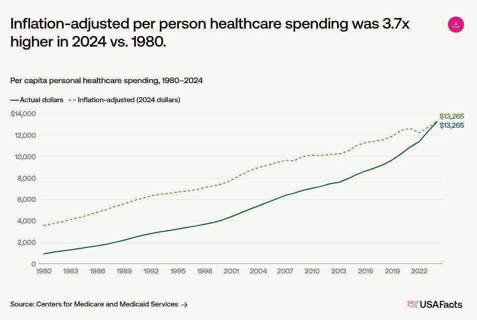
A chart from our article on personal healthcare that displays actual dollars (solid line) and inflation-adjusted dollars (dotted line).
Like adjusting for inflation, we adjust for age to account for differences in age distributions across populations or over time. This makes rates more comparable by reducing the influence of changes in the age distribution within a population.
This screenshot from one of our videos shows the difference in age ranges within the US from 1980 to 2022. See how there are more people in some ranges than others? Bigger age groups could sway data in a certain direction, hence why we adjust.
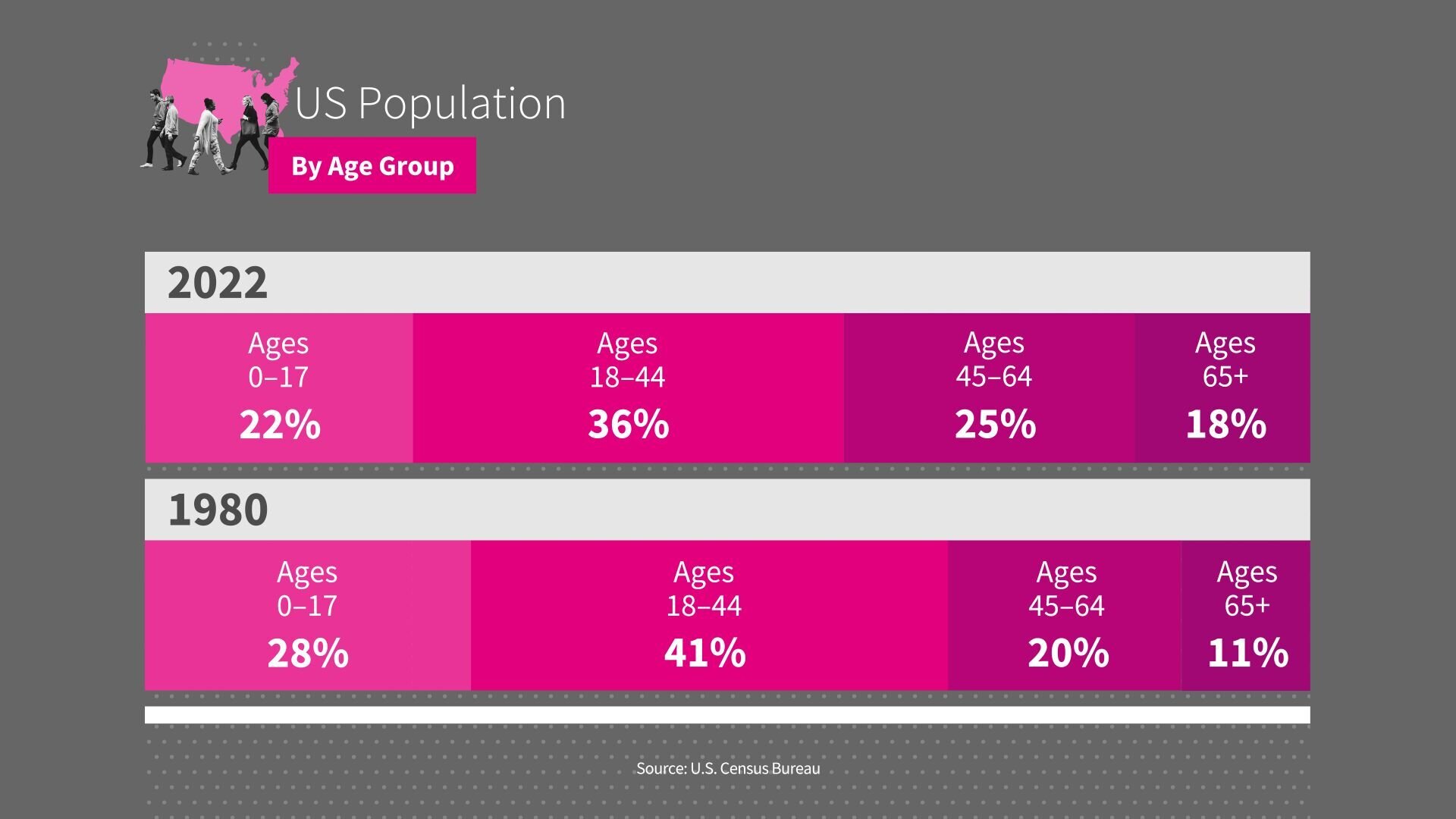
An image from our Just the Facts video, “America by the Numbers,” that shows the difference in population by age.
Here’s an example: more people in the US die in accidental deaths from falls than from motor vehicle accidents. If you’re wondering how that’s possible, it’s because individuals ages 65 and older accounted for 17.6% of the US population in 2023, contributing to a higher crude (aka unadjusted) fall-death rate in this group. So the raw number of deaths from falls was indeed high, but without adjustment, it makes it seem like the likelihood of death from an accidental fall was high for all age groups.
Adjusting for age by applying standard weights to each age-specific death rate makes the data point more comparable across all age groups.
So, after adjusting both causes of death to the same standard age distribution, the trend shifted: the rate of motor-vehicle-related deaths exceed fall-related deaths.
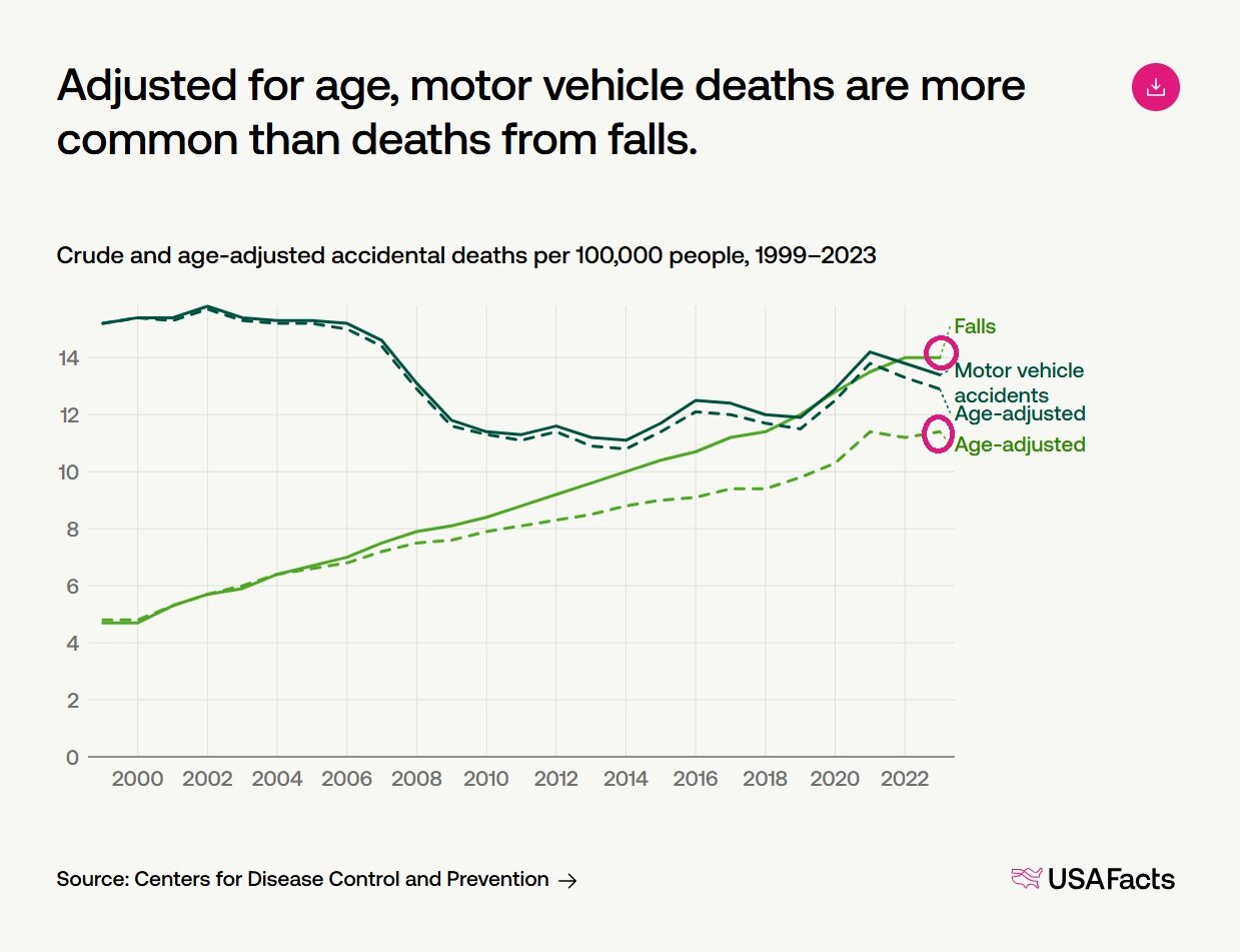
An chart from our article about rising accidental deaths, showing the difference between unadjusted and age-adjusted data.
Seasonally adjusted data removes the effects of regular seasonal patterns. Adjustments help make data more comparable across time periods, locations, or populations by accounting for factors that can influence the underlying measurements, such as:
Without adjusting for seasonality, the data would have spikes and dips related to these events. But because these seasonal patterns occur regularly, we can adjust the data to account for them. This removes fluctuations and makes it easier to spot broader trends, like in the employment chart below.
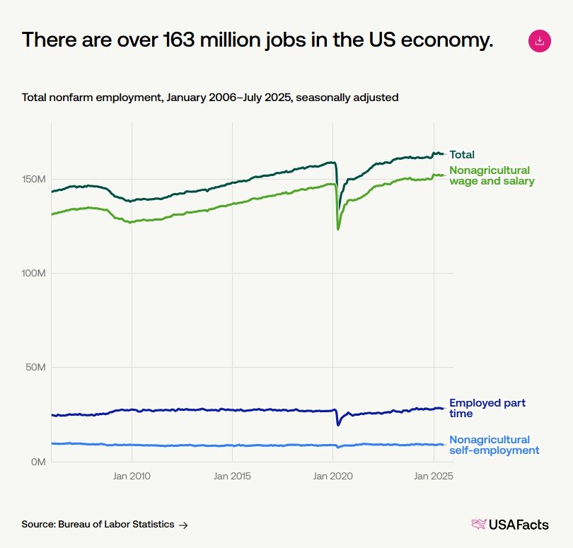
An chart from our article about the monthly BLS jobs report showing seasonally-adjusted data.
Last but not least, you may encounter data that is forward-looking: projections. Projections are estimates of future values based on assumptions, statistical models, or historical trends. Projections are NOT actual observations and may differ from future outcomes if conditions change.
Because projections aren’t actual observations, this data isn’t as common at USAFacts. But they do come up on occasion. We have an article on fastest growing professions in America, which is projection data by the Bureau of Labor Statistics.
Or, there’s this chart, in which data from the Centers for Medicare and Medicaid Services projects the Hospital Insurance Fund to deplete by 2033.
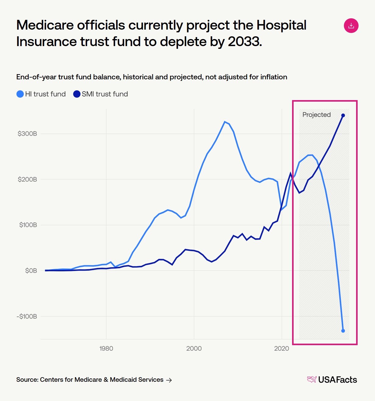
And that’s a wrap on the types of data you may see on the USAFacts website, and elsewhere! I hope these concepts help you feel more empowered to understand data and charts.
Any other concepts we should explain in Analyst Notes? Drop us a line: [email protected]
| # | Наименование новости | Тональность | Информативность | Дата публикации |
|---|---|---|---|---|
| 1 | Ask an Analyst: Creating a data-driven State of the Union | 0 | 11.23 | 19-02-2026 |
| 2 | Ask an Analyst: Lending some color to the political map | 0 | 8.52 | 12-03-2026 |
| 3 | Ask an Analyst: Putting the pieces together on military troop data | 0 | 8.57 | 05-02-2026 |
| 4 | Ask an Analyst: The cost-of-living metric I can’t stop talking about | 0 | 12 | 04-03-2026 |
| 5 | Ask an Analyst: Putting White House construction in context | 0 | 9.22 | 12-02-2026 |
| 6 | Ask an Analyst: Searching for data on ICE | 0 | 9.18 | 29-01-2026 |
| 7 | Ask an Analyst: What makes a "donor state"? | 0 | 9.18 | 26-03-2026 |
| 8 | Ask an Analyst: What's up with changing job numbers? | 0 | 7.74 | 26-02-2026 |
| 9 | Analyst notes: The clock on Congressional sessions | 0 | 8.34 | 27-04-2026 |
| 10 | Analyst notes: How did pandemic-era ACA subsidies work, and why did they expire? | 0 | 11.13 | 10-04-2026 |