Просмотр новости
Найдите то, что Вас интересует
 Спутники
 РН
РН SpaceX
 Роскосмос
 NASA
NASA
СпутникиРНSpaceXРоскосмосNASAMost flyers get ignored for a simple reason: people can’t understand them fast enough. People don’t read flyers the way they read books or blogs. Instead, people scan them. If you’ve ever wondered how do I design a flyer that stands out, the answer usually isn’t adding more design elements. It’s making the message easier […]
The post How to Design a Flyer That Stands Out appeared first on Venngage Blog.
Most flyers get ignored for a simple reason: people can’t understand them fast enough.
People don’t read flyers the way they read books or blogs. Instead, people scan them.
If you’ve ever wondered how do I design a flyer that stands out, the answer usually isn’t adding more design elements. It’s making the message easier to understand at a glance.
If your headline, offer or call to action (CTA) isn’t clear within a few seconds, you’ll lose people fast.
On the other hand, a good flyer does three things quickly: grabs attention, communicates one clear message and tells readers exactly what to do.
In this blog, I’ll share 16 actionable tips on how to design a flyer that stands out with great messaging, good layout choices, clear visual hierarchy and CTAs that convert.
The fastest way to ruin a flyer is to expect it to do everything.
Before you think about design, colors or images, decide what exactly you want the flyer to accomplish. Do you want it to entice people to visit your store, scan your QR code or fill out a form?
For example:
Check out this flyer design template, for instance. It doesn’t cram a long backstory, the restaurant’s menu or a list of specials. The flyer sticks to one job: getting people through the door.
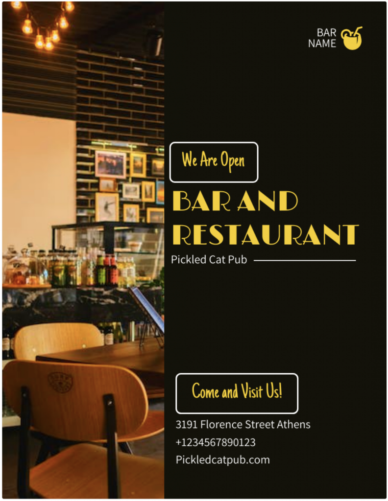
A clear goal also shapes the headline, CTA and layout. Every element in a flyer design has a purpose. If you need help defining those elements, review these flyer design tips and examples or learn what a flyer is and when to use one.
If you have multiple goals, create separate flyers or use a brochure instead.
2. Know the audience and placementA flyer works best when it’s designed for the people who’ll see it and the place they’ll see it.
For instance, parents often want clear details and practical information. Event attendees may respond to bold visuals and energy. Local service customers usually look for credibility and easy contact options.
If you’re creating a flyer for your company, these business flyer examples can help.
Placement matters, too. A flyer on a crowded community board needs a headline people can spot from a distance. A handout or email attachment can carry a bit more detail.
This flyer leads with what matters most to conference-goers: who’s speaking, when it’s happening, where it’s taking place and how to register.

A flyer like this will likely perform better in a corporate lobby than beside the weekly grocery specials. Before you start designing, ask yourself: Who will see this flyer and where will they see it?
3. Use a bold, benefit-driven headlineYour headline does most of the heavy lifting.
People should understand the offer, event or benefit within seconds. Compare “You’re Invited” with “Free Community Fitness Class This Saturday.” One creates curiosity. The other creates clarity.
Keep your headline short, specific and easy to read from a distance. Offer-based, benefit-driven, event-focused and urgency-based headlines tend to work well.
If you’re wondering how to make a flyer stand out, start with the headline. A headline can be clever, but it should never leave readers guessing what the flyer is about.
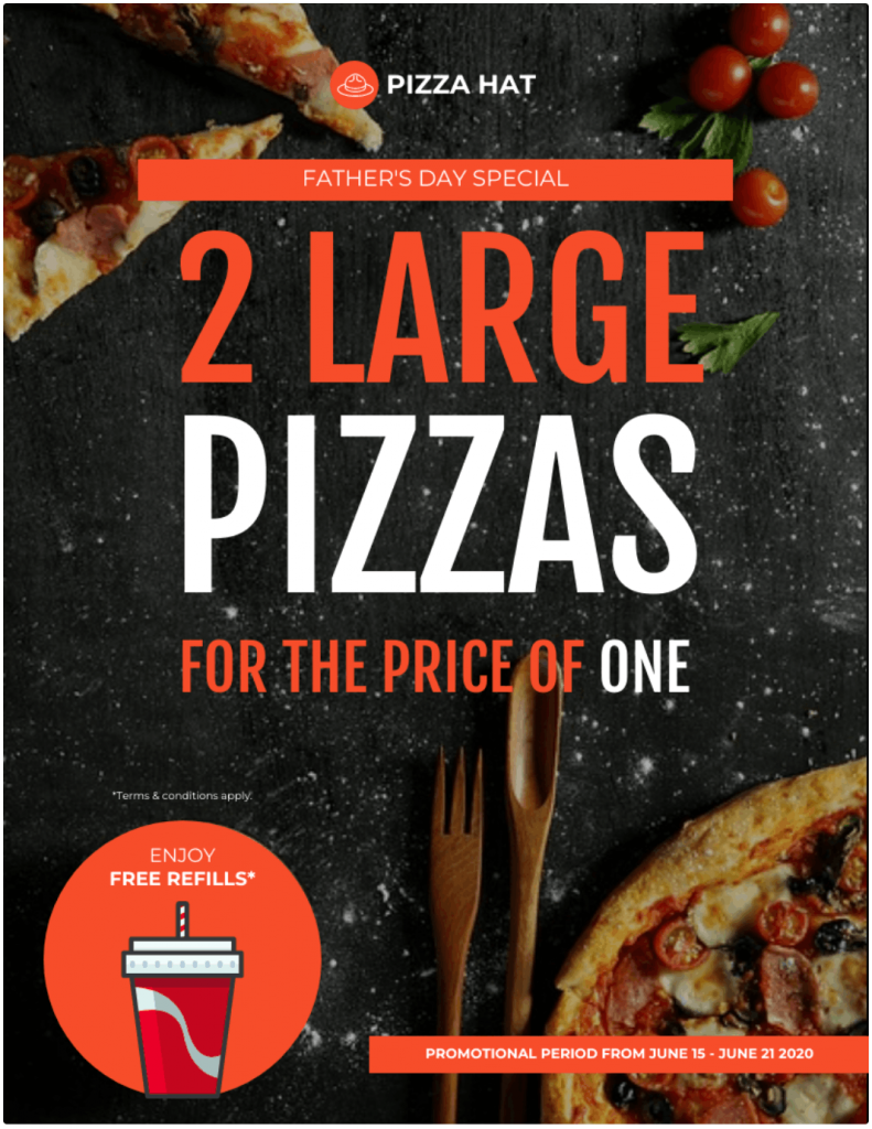
After reading this flyer headline, you know exactly what’s in it for you: two for the price of one.
People should understand your flyer in seconds. That’s where visual hierarchy comes in.
It guides readers from the headline to the image, key details and CTA without making them hunt for information. If you’re new to the concept, this guide to visual hierarchy breaks it down in more detail.
Many of the best flyer layout tips come down to the same idea: make it obvious where people should look first, second and third. Great flyers follow a simple path: headline, visual, offer, details, then CTA.
A strong visual helps lead that journey. Choose one image, illustration or graphic that supports the message. A food event should show the food. A real estate flyer should show the property. A fitness flyer should show people in motion.
Keep important elements larger, group related information together and use spacing to create breathing room. If everything is bold, colorful and competing for attention, readers won’t know where to look first.
A simple rule: one focal point, one message, one next step.
There’s a lot happening in this flyer design, but the hierarchy keeps it under control. Your eye lands on the top image first, then the details, then the offer. That’s exactly how it should work.
Most people don’t read flyers line by line; they scan them.
Stick to a short subheading, three to five key points, essential details and one CTA. For most flyers, 100 to 200 words is plenty.
Use the 5 Ws as a filter: Who is it for? What’s the offer? When and where does it happen? Why should anyone care?
If a detail doesn’t help someone understand the offer or take action, move it to a QR code, landing page or brochure.
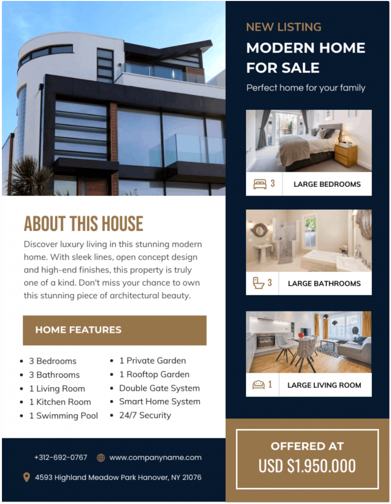
Here’s another real estate flyer template. The layout is clean, the copy is easy to scan and the design makes key details easy to find.

Fonts and colors should make your flyer easier to read, not harder.
Stick to two or three fonts and prioritize readability, especially for headlines, dates, prices, phone numbers and CTAs. If people have to squint, the design needs work.
Choosing the right typeface is easier when you understand how different fonts influence readability, hierarchy and tone. Read our guide on how to choose fonts to make better typography decisions.
The same goes for color. A simple palette of two or three colors usually feels cleaner than a page full of competing shades. Use contrast to draw attention to the headline and CTA and make sure the text stands out clearly from the background.
Color choice matters, but contrast does most of the heavy lifting. Our guide to contrast in design goes into deeper detail on how you can pick colors that work well together before finalizing your palette.
A few design principles go a long way: contrast creates emphasis, alignment creates order and white space gives content room to breathe.
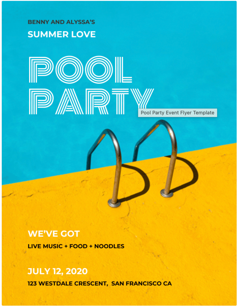
Take a look at this flyer, for instance. The font choice feels fun and seasonal and the color contrast brings the summer energy to life.
The easiest way to clutter a flyer is to fill every empty space.
White space helps readers focus on the headline, offer, CTA and contact details. It also makes the flyer easier to scan. If you want to learn more about the concept, learn how to use white space in design or tips on applying negative space in your design.
Use margins, spacing and section breaks to separate ideas. If something feels crowded, remove content before shrinking the text.
A little breathing room often does more for a flyer than another paragraph, icon or logo.
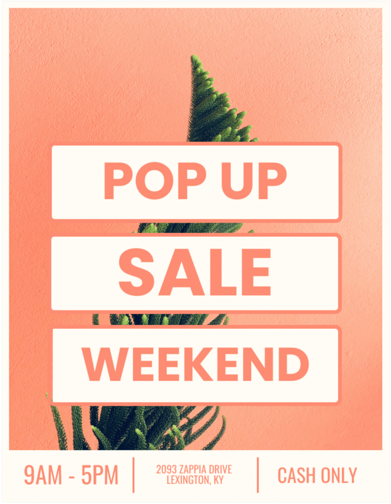
This flyer has one of the best uses of white space I’ve seen. The layout is clean, the headline has plenty of room to breathe and you can understand the offer in seconds.
A flyer creates a simple moment of decision: someone likes what they see and wonders what to do next.
Your CTA should answer that question immediately. Tell people exactly what action to take, whether that’s calling, registering, scanning a QR code, visiting a website or claiming an offer.
Make that action easy to spot. Give the CTA its own space and make supporting details, such as a phone number, website, event location or RSVP deadline, easy to find. If someone has to hunt for them, the flyer still needs work.
Adding urgency can help too. “Register by Friday” or “Offer ends Sunday” gives people a reason to act now.
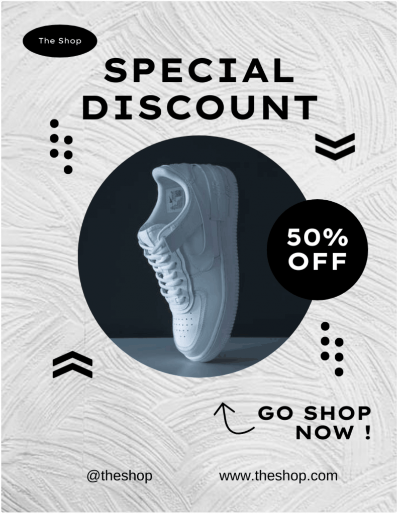
This flyer does all of that. “GO SHOP NOW” is clear and feels urgent.
One common mistake is asking readers to do too many things at once. Pick one primary action and build the flyer around it. If you’re using a QR code, test it before printing and make sure it leads to a mobile-friendly page.
9. Use the five core parts of a flyerMost flyers follow the same formula: a headline, a visual, a clear offer, essential details and a CTA.
The headline grabs attention. The visual reinforces the message. The offer gives people a reason to care. The details help them decide. The CTA tells them what to do next.
This flyer checks all the boxes. You can grasp everything in seconds: tournament, golfer image, event details, pricing and registration CTA.

These five elements also create the natural flow of a flyer: headline, visual, message, details, then action. Check out these flyer examples and you’ll notice the same pattern again and again.
Add other design elements if they support the message. These five parts should always come first.
10. Avoid common flyer design mistakesMost flyer problems come down to clarity. People should understand the offer, value and next step within a few seconds.
Watch for the usual culprits: too much text, weak headlines, missing CTAs, low-quality images, poor contrast, cluttered layouts and hard-to-find contact details. Limit yourself to two or three fonts, use a small color palette and give important elements room to breathe.
If you’re stuck, these flyer ideas can help spark inspiration before you start designing.
If you’re designing for a business, keeping visuals, colors and messaging aligned with your brand also helps.
It might be tempting to use ChatGPT or an AI flyer maker to save time. But AI-generated visuals don’t always follow your brand’s colors, style or visual identity. Read our guide on how AI-generated visuals can break your brand and what to do about it.
Before you print, ask five questions: Is the offer obvious? Is the headline easy to spot? Is the CTA clear? Can people find the contact details instantly? Is there anything you can remove?
Most flyer improvements come from cutting clutter, not adding more.
Related: Bad Infographics: The Worst Infographics from last 5 Year (+ Lessons from them)
11. Fix a flyer with too much textSome flyers need more information than others. But that doesn’t mean you need to cram everything onto the page. The goal is to make the important information easier to find.
Start with the essentials: the headline, main offer and CTA. Everything else should support them. Turn long paragraphs into bullets, use clear section headers and group related information together. Columns and icons can help, but only if they make the page easier to scan.
Many graphic design tips come back to the same principle: readers shouldn’t have to work to find key information.
If content still feels crowded, move schedules, menus, maps, policies or long descriptions to a QR code, landing page or brochure. And don’t solve the problem by shrinking the font. Sometimes the best edit is removing information or choosing a format better suited for the message.
12. Pick the right tool for the jobIf you’re wondering how to make a flyer online, choosing the right tool is usually the easiest part.
Most modern tools can help you build a professional flyer design. The bigger challenge is getting the message, hierarchy and CTA right.
If you’re evaluating the best flyer design software, here are a few popular options:
Every tool has its strengths. If you’re unsure which one fits your needs, read our guide to the best flyer design software before making a decision.
13. Use ChatGPT or AI for flyer helpChatGPT can help with many parts of flyer creation, especially when you’re stuck on the messaging.
Use it to brainstorm headlines, write subheadings, shorten long paragraphs, generate CTA ideas, adapt copy for different audiences or suggest flyer layouts. It’s also useful for organizing text-heavy content and creating prompts for AI image or design tools.
Just don’t treat the output as final. AI-generated images can contain errors and AI-written copy can invent details if your prompt lacks context.
Before you publish or print anything, verify the dates, prices, locations, URLs, phone numbers and QR codes. Then review the design itself. Can someone understand the offer and the next step within a few seconds?
AI is great at generating first drafts. Your judgment is what turns them into effective flyers.
Related: How To Create Infographics Using ChatGPT
14. Prepare the flyer for print or digital useA strong design still needs the right file setup. Before you print or publish, do a quick quality check.
Use a size that fits the job:
For print, use high-resolution images, export as a PDF, check bleed and margins, proofread every detail and print one test copy first.
For digital use, make sure the text stays readable on mobile, images look sharp and links or QR codes work properly.
A flyer that looks great on screen can look very different once it’s printed or shared.
15. Distribute and measure the flyerA great flyer still needs the right audience. Think about where people already spend time, then put your flyer there. A campus flyer belongs on campus. A local event flyer works better in cafés, libraries, community centers and neighborhood boards. Always get permission before posting and factor in weather, seasonality and location clutter.
Then track what happens. Use a unique QR code, landing page, promo code or phone number. Ask customers how they found you. Those small tweaks show which locations drive results and which ones don’t.
Design gets attention. Distribution puts that design in front of the right people. Measurement tells you whether either one worked.
16. Use this final flyer design checklistBefore you print, post or share your flyer, do one final review.
Message and hierarchy
Design and readability
Details and CTA
Quality control
Here are answers to some of the most commonly asked questions about flyer design.
1. What makes a flyer eye-catching?An eye-catching flyer combines a clear headline, strong visual hierarchy, high-contrast colors, a relevant image and a focused message. Readers should understand the main offer within a few seconds.
2. What should you avoid when designing a flyer?Avoid cluttered layouts, excessive text, tiny fonts, low-quality images, poor color contrast, multiple CTAs and missing contact details. These common flyer mistakes make flyers harder to read and act on.
3. What should a flyer include?A flyer should include a headline, visual, main message or offer, essential details, a call to action and contact information. These five elements help readers understand the message and take the next step.
3. Can I use Canva to make flyers?Yes. Canva is a beginner-friendly flyer design tool with templates, drag-and-drop editing, brand customization, stock images and print-ready export options for both digital and printed flyers.
4. Can ChatGPT help create a flyer?Yes. ChatGPT can help write flyer copy, generate headlines, suggest layouts, create CTAs and develop design prompts. Review all content carefully before publishing or printing your flyer.
Great flyers win attention by making decisions easyThe flyers that get noticed usually have a few things in common: a clear message, a strong visual and an obvious next step.
Pick one goal. Speak to one audience. Give people one thing to do. From there, focus on making the information easy to scan and easy to remember.
Before you print or publish, run through the checklist one last time. Then choose one of the customizable flyer templates from Venngage and start building your flyer for free.
| # | Наименование новости | Тональность | Информативность | Дата публикации |
|---|---|---|---|---|
| 1 | How to Create Accessible Flyers Without PDF Remediation | 0 | 8.73 | 22-06-2026 |
| 2 | How to Create Accessible Presentations and Handouts That Meet PDF/UA Standards | 0 | 7.36 | 29-06-2026 |
| 3 | 8 Best Adobe Express Alternatives in 2026 (Free + Paid, Tested) | 0 | 10.36 | 15-06-2026 |
| 4 | How to Create an Effective Timeline ( + Template) | 0 | 8.19 | 23-06-2026 |
| 5 | Canva Accessibility Review: Can It Create Accessible PDFs? | 0 | 6.97 | 08-06-2026 |
| 6 | How to Create Accessible Forms and Charts Without PDF Remediation | 0 | 7.1 | 18-06-2026 |
| 7 | Как сделать бренд сильнее, а не просто «покрасивее» 💪 Есть ... | 5 | 7 | 20-07-2026 |
| 8 | «Ничего не изменилось… кроме оформления». Именно так однажды сказал мне ... | 0 | 6.66 | 22-07-2026 |
| 9 | How to use video storytelling to connect with your audience | 0 | 7.35 | 26-05-2026 |
| 10 | How to Market a Travel Agency | 0 | 4.23 | 25-06-2026 |